

DVD/BR AVAILABILITY: Looney Tunes Golden Collection, Vol. 5 (DVD); Porky Pig 101 (both from Warners Home Video)
You may view a crisp correct-ratio print of this cartoon HERE. The screen grabs are provided by our great pal Devon Baxter, and make this frequency of posting possible. Thank you, Devon, for this and all the great work you do in exploring and documenting animation history.
<><><><><><><><>
Black-and-white theatrical animation was dying off in 1941. Warner Brothers, Terrytoons and Paramount dropped their monochrome series by 1943, in the wake of Disney going all-color in 1935. The Screen Gems studios hung onto the less costly process through 1946, giving messed-up anti-classics like Kongo-Roo and Giddy-Yapping an additional layer of WTF.
Porky's Preview is significant as Tex Avery's final black-and-white effort (barring the aborted Speaking of Animals series for Paramount and his commercials of the 1950s). As with Famous Studios' last monochrome, Cartoons Ain't Human (1943), it's a cartoon about making a cartoon, with faux-primitive artwork. (The Famous film fares worse at creating "bad" animation, and cuts from Popeye's home-made cartoon to its real-life projection, as if to assure the audience that it's okay to see this stuff.)
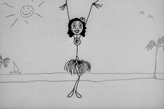
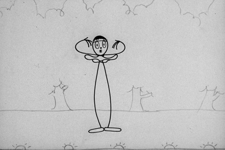
In both cartoons, the arguable opportunity lost is that the "bad" artwork must still be professional-looking. The squiggles and naive drawing of Jack Mendelsohn's Jackys Diary, which was successfully translated to animation in the 1960s, or the UPA cartoon Baby Boogie (1955), were not feasible in the '40s, to judge from these two similar cartoons. The stick figure drawings are still slick and professional-looking, which somewhat dampens their intended humor. The animation is minimalist, but it's the obvious work of skilled craftsmen who know what they're doing. Both cartoons would work much better with lumpen, scraggly animation, but it wasn't in the cards for either studio. Higher-ups and exhibitors might have complained (and not gotten the essential idea of either film).
These are compromised cartoons to the modern eye, and much uglier, more carelessly primitive animation has since appeared on TV and the Internet, which further waters down their impact.
Porky's Preview is narratively slight and gentler than usual for Avery. It may have been devised as a cheater cartoon, from the viewpoint of Avery and his team. Though there is a degree of nuanced movement in these stick-figures (which, at times, resemble the more stylized figures of a mid-'30s Van Beuren cartoon), the animation was likely easier to accomplish, and the simplicity of the film may have kept it under budget. If this spate of black and white films was an attempt to economize, such streamlined animation and minimal backgrounds did the trick.
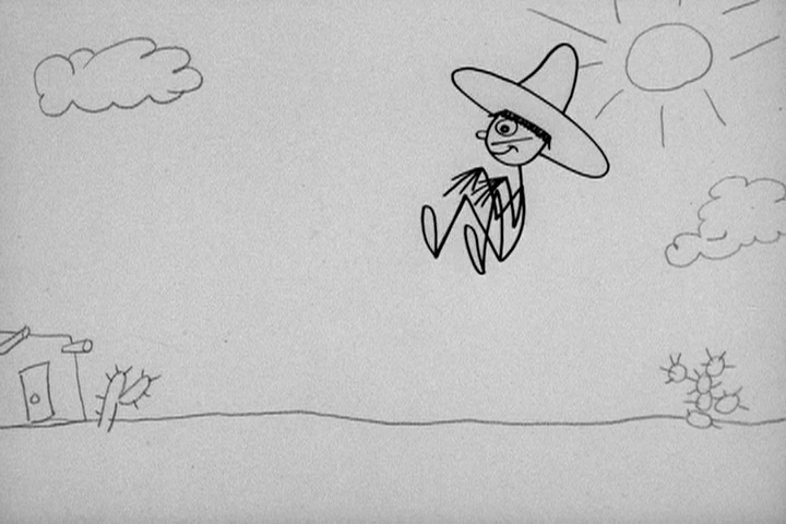
The film's wraparound story occurs in a rustic animal land not far from the settings of early Mickey Mouse cartoons. Its sole location is a barn. The kerosene lanterns and haphazard hand-painted sign sets a bucolic mood not unlike Chuck Jones' Joe Glow the Firefly (also 1941).


 We cut to a tighter shot of the skunk, which stresses more developed character animation. Ross? McKimson? Or both--Robert McKimson did the character designs for this short.
Acting on a straight line from heaven, skunk informs cashier that he's only got one cent.


 Skunk really wants to see Porky's cartoon. He passes the stage door and ponders how he might gain admission...


The film's wraparound story occurs in a rustic animal land not far from the settings of early Mickey Mouse cartoons. Its sole location is a barn. The kerosene lanterns and haphazard hand-painted sign sets a bucolic mood not unlike Chuck Jones' Joe Glow the Firefly (also 1941).


A mother hen pays for three children's tickets, based on her current egg count. She exhorts her unborn kids to follow her into the theater, as if they have a choice.


An indifferent kangaroo ticket-taker mans the door. Devon B IDs this as Virgil Ross' work.


To cut the cutesy a bit, there's this morbid moment:


The dog who belongs to that arm doesn't seem to mind its removal. There's no cry of pain, and this happy one-armed customer is led to his seat by a firefly/usher--also Ross' work.


Another dog digs for coinage when terror strikes. (Still Ross' work.)


In this perfect Avery take pose, note the dog's balloon-like shapes and the closeness of his eyes. For the blink of an eye, the director's drawing style slips into the picture.


Cashier sees this frightening figure...


Of course--a skunk. His theme is a whimsical adaptation of "The Teddy Bears' Picnic," a 1907 pop ditty that fast became a kiddie-record staple once lyrics were written for it in 1932. It's a typically thematic choice of Carl Stalling, but its waddling minor-key mood fits the sequence.

Armed to meet this challenge, cashier informs skunk the entrance fee is a nickel.


Acting on a straight line from heaven, skunk informs cashier that he's only got one cent.


That's cent with an "s."

"Get it?" he asks us. Yep. Got it.


...as we lap-dissolve to the cartoon's most often-seen sequence, thanks to its tireless use in Warner Home Video promos for the dearly departed Looney Tunes Golden Collection series. This is one of Virgil Ross' nicest pieces of character animation, in concert with Mel Blanc's voice.


Avery loves curtains and theater settings.


MC Porky asks his rustic audience to calm down.


Porky's eyes are spread far apart in this character design--almost to the point that they have an uncanny effect. In motion, the effect is less striking. And while we're on the topic, have you ever noticed something a little odd about the Looney Tunes title card of this era?


 Porky's false modesty also seems to spoof Mickey Mouse's aw-shucks mode from his early films.

 Porky explains he's the auteur of the film, but adds that it wasn't hard 'cos he's an artist.


 I wish the animated portions of the film-within-film had this level of sloppiness. There's a great vigor to these dashed-off titles that is removed from the stylized, highly geometrical animation.


 Avery brings out one of his pet jokes, used throughout his cartoon career. He does this bit twice in the same cartoon.


 Carl Stalling's score has discords and clumsy orchestration but, like the animators, these professional studio musicians can't play badly. They play contrived "bad" music with the same sight-reading polish they'd apply to a Franz Waxman film score.

 This animation is more like it. The wheels are misshapen, there's zero squash and stretch, and the forced-sync (and lettered) TOOTs are spot-on.


 Gag of note: runt soldier gets rhythmic kick in keester while trying to keep in step.


 This geometric ballet is a reprise of a gag from Avery's 1938 cartoon The Penguin Parade. Read all about it elsewhere on this here blog.


 "Horse Race" means Bing Crosby reference, no matter what cartoon studio of the era.


 Yup. Bonus points for message coming on-screen sideways with the sluggish nag.


 Here's an entertaining article about Crosby's passion for horse racing, and how he used his radio appearance to foster this slow-horse business into a thing suitable for reference-crazy Warner Brothers cartoons to cite.


 The spastic and off-kilter animation of this sequence is sublime, as are Porky's self-edits and attempts to better himself as an animator. It's tempting to credit this sequence to Rod Scribner, tho' I know not for certain.


 The manic forced timing of the dancer's body, as it jolts and jerks to the familiar strains of "La Cucaracha," shows the peak of Avery's interest and investment in this cartoon.


 This finale was often snipped out of TV prints, for reasons soon to be obvious. The animation of the faux-Jolson, by Robert McKimson, with voice-work by double-talkin' comedian Cliff Nazarro, again breaks with the conceit of "primitive" animation.


 This is way too good animation for the likes of Porky. McKimson's flair for full-bodied, expressive character animation and subtleties of contour is here in spades. Look at the drawing of the character's left hand, in the drawing below. Those foreshortened fingers are spot on. An animator of Porky's skill set wouldn't be able to make those digits anything but sticks or swollen sausages.


 The on-cue raincloud is perfect. This sequence gets big laughs in theaters (or, at least, it did, back in the 1980s, when I ran this cartoon in uncut form at FSU's long-demolished Moore Auditorium.)


 A subtle touch are the solid raindrops that bounce off Jolson's head. No attention is called to them, but I'm sure the staff was tickled by this aspect of the scene.


 I'm always reminded of this interstitial from The Rocky and Bullwinkle show when I see the big finale.


What is going on with the rightmost finger of Porky's right hand? Whether thumb or pinky (and this is open to debate), its painful position gives the impression of, at the very least, a bad sprain that merits medical attention.

We now resume our regular blogcast...


Zips back for a quick thankew.


This sequence creates an instant disconnect from the titles. It looks like it might be a found piece of European animation from the silent era. The animators' inability to exclude the more sophisticated principles of their craft is part of the issue. The figures still have recoil, reaction and weight. A child's animation would not employ these skills. It's as if the animators couldn't unlearn these techniques, or were afraid to go so far off the beaten path. It's attractive looking stuff, but it isn't primitive.


And, of course, the guy from DSC trails the parade in a thankless job.


You just know "California, Here I Come" is about to hit the soundtrack.


And we get another pet Avery gag, which ends in an inspired manner:


This is sheer brilliance.


We're back to the more professional-looking "poor" animation for the next bit:


(in reverse, at double speed)


Hula...


The expressionistic written dialogue and sound effects are great.


Though that dratted craftsmanship brings a distracting action and reaction to the dancer's grass skirt, the bit is quick and funny. And it's a warm-up for the most divine moment of Porky's Preview: el baile Mexicano.


And after all that effort...scratched out for good!

A chorus line recycles the common gag from the circus parade bit.


A ballerina who'd fit right into the Van Beuren cartoon Magic Mummy does her thing.
And then she splits.


A wonderfully ugly hand-drawn iris will out.


Eager for a positive reaction, Porky takes the stage.

(same walk cycle seen earlier in film)


Auteur is startled by his audience of one.


Porky's take looks very Robert McKimson-ish.


This visitor from the other side of the wind approves.
The gaping maw behind him tells its own story.


Porky's Preview succeeds at its goal, despite a certain compromise in its animation. It works well enough, and is playful and funny without being coarse or corny. It's another ground-breaking moment in Avery's career--one he wouldn't repeat.
Though the concept of cartoon characters doing their own inept animation has several precedents (including two by the Van Beuren studio in the early 1930s), Avery's version is more knowing, clever and playful. It doesn't reach the manic heights of Cartoons Ain't Human, a film made in reaction to this cartoon. But it advances the idea of breaking away from the slick technical look of studio animation.
The promise of this freedom from the rigid science of animation was one step in the fragmented process that led to the "cartoon modern" style, which Chuck Jones would experiment with further at Warners. At the same time, John Hubley toyed with it at Screen Gems and Shamus Culhane at Walter Lantz.
Avery preferred the "moldy fig" look of traditionally painted backgrounds, recognizably "real" objects and characters in the mold of the slick Hollywood cartoon standard. He succumbed to the modern style in the M-G-M cartoons created after his leave of absence, including 1954's Billy Boy and 1955's Dixieland Droopy. As Joe Adamson* noted, Avery's comedy sense hinges on the invasion of the "real" by the impossible. And though the two late cartoons cited are clever (and in moments brilliant), they are a step divorced from the solid ground upon which Avery built his cinematic foundation.
The staid, conservative look of such films as King-Size Canary, Bad Luck Blackie, Little 'Tinker and Little Rural Riding Hood disarm the viewer. They look like any other cartoon and, as such, they promise to deliver the predictable. When they yank the carpet beneath our feet, our tumble is longer and stronger because we didn't think (name of film) had such potential to surprise us. Conformity on the surface was Avery's secret weapon. This camouflage gave him a green light to commit some of the most subversive moments in American film.
As Avery approaches the zenith of his work as a film-maker, experiments like Porky's Preview will disappear. It was fun to work with this idea for seven minutes, in a cartoon that helped stretch the Schlesinger studio budget, but that's all it was to him. Avery and staff will experiment with another aspect of animation--celebrity caricature--in the next released film, which we'll look at soon enough...
* I believe Adamson says words to this effect in his groundbreaking book Tex Avery: King of Cartoons. My copy sits in storage 200 miles from me at the moment.
UP NEXT: Hollywood Steps Out
I think you're right that five minutes of truly awful child-like animation mixed with a Carl Stalling score that matched it in sonic cacophony would have irked a lot of the theater owners still booking the lower-cost Looney Tunes. The combination might have made for a good 10-second gag -- Jones tried the animation end with the quick-hit gag of horribly-drawn Bugs in "Rabbit Rampage" -- extending that out to the bulk of the cartoon probably would have been a little too experimental for comfort (a confrontation we'll get to later in 1941 with Bugs' edited out cliff plunge).
ReplyDeleteIt's also probably the best of the later B&W Looney Tunes where Porky's essentially a limited participant in his own cartoon. Unlike some of the Clampett & Freleng B&W efforts, Tex gets around keeping Porky out of the picture most of the way by making him the artist of the picture, so it doesn't feel as if he was simply shoehorned into the film just because the contract with J.L. required him to be in it. As a child's version of an Avery spot-gag cartoon, it doesn't have the sustained narrative or end build up of "Cartoons Ain't Human" (the late Fleischer-early Famous pacing on the Popeyes really does rival the best of the West Coast efforts of the same period), but given what some of the other Porky efforts from the 1939-41 period looked like, it was a novel and entertaining way for Tex to use the character while at the same time still doing what he wanted to do.
I think the spiky-haired figure that shows up in the "title cards" at various points, and at the very end of the train sequence, is a caricature of studio executive Henry Binder, who shows up in a lot of 1930s and 1940s WB cartoons.
ReplyDelete